Table of Contents
Android apps are super popular, with 75% of smartphones being android. And this is why when you are trying to appease such a large user base, you want your app to stand out. This brings us to importance of android app design.
Now, if you are new to android app development, there are some things that you need to understand about the designing part. And that’s what we shall be discussing in this blog.
Therefore, with this said, let’s get started by comparing ios and android app designing.
iOS vs Android App Design

Well, you can’t discuss android app design without mentioning iOS. So, how does app designing process differ for these two platforms?
Let’s see just that below:
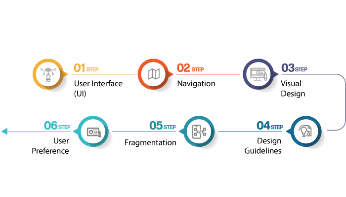
User Interface (UI)
iOS and Android have distinct design languages. iOS follows a clean and minimalist approach, emphasizing clarity and simplicity. The user interface is sleek, with intuitive gestures and smooth animations. On the other hand, Android offers more flexibility in UI design. It focuses on customization and offers a range of design options, allowing app developers to create unique interfaces.
Navigation
When it comes to navigating through apps, iOS app design guidelines suggests to utilize bottom navigation bars and swipe gestures. This approach keeps the main actions within easy reach of your thumb. Android, on the other hand, typically uses a combination of navigation drawers, tabs, and floating action buttons, providing multiple entry points to different app sections.
Visual Design
iOS places a strong emphasis on consistency and uniformity. You’ll notice consistent use of icons, typography, and color schemes across iOS apps. This creates a cohesive experience that feels familiar and intuitive. Android, meanwhile, encourages app developers to embrace their own visual styles, allowing for more diverse and personalized designs.
Design Guidelines
Both iOS and Android have design guidelines to help app developers create cohesive and user-friendly apps. Apple provides the Human Interface Guidelines (HIG), which offer detailed recommendations on designing for iOS. Similarly, Android provides Material Design guidelines, emphasizing a clean and modern aesthetic. These guidelines help ensure that apps on each platform adhere to certain standards, enhancing the user experience.
Fragmentation
Android’s open nature leads to a wider range of devices with different screen sizes and resolutions. This fragmentation poses a challenge for app designers who need to account for various screen dimensions. In contrast, iOS has a more controlled ecosystem, with a limited number of devices and screen sizes, making it somewhat easier for developers to design apps that fit well across devices.
User Preference
Ultimately, the choice between iOS and Android app design often depends on user preference. Some users prefer the sleek and consistent design of iOS, while others appreciate the customization options and flexibility offered by Android. Both platforms strive to create visually appealing and user-friendly experiences, tailored to the preferences of their respective user bases.
Now with iOS vs android out of the way, let’s get to the importance of android app design in the section below:
Importance of Android App Design

When it comes to Android app design, you might wonder why it’s so important for you, the user.
Well, let me tell you, designing an app with your needs in mind is crucial for a delightful and intuitive user experience.
Here are a few reasons why Android app design matters to you:
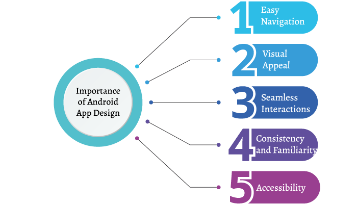
Easy Navigation
Imagine opening an app and feeling lost, not knowing where to go or what to do next. That’s where good app design steps in.
Well-designed Android apps prioritize simplicity and guide you effortlessly through their features. Clear navigation menus and intuitive icons make it a breeze for you to find what you’re looking for.
Visual Appeal
Aesthetics play a vital role in your app experience.
Engaging visuals, appealing color schemes, and thoughtful use of animations create a visually pleasing environment that captures your attention and keeps you engaged.
A good android app design makes interacting with it a delightful and enjoyable experience.
Seamless Interactions
Have you ever used an app that responded slowly or had unresponsive buttons? Frustrating, right?
Again a good android app design ensures smooth and responsive interactions, making your experience fluid and enjoyable.
Buttons, menus, and other interactive elements are designed to respond promptly to your touch, ensuring you can effortlessly navigate the app.
Consistency and Familiarity
Android app design follows certain design guidelines, such as Material Design, to provide a consistent and familiar experience across different apps.
This consistency allows you to quickly understand how to interact with new apps, reducing the learning curve. Design elements like familiar icons, standard placement of menus, and consistent typography contribute to a seamless experience for you.
Accessibility
A good Android app design considers accessibility for all users, including those with disabilities.
This means ensuring that the app is easy to read, supports various screen sizes, and provides options for adjusting text size or color contrast.
By focusing on accessibility, developers make sure their apps are inclusive and can be enjoyed by a broader audience.
So, there you have it! Android app design is crucial for you as the user. It enhances your overall experience, making the app easy to navigate, visually appealing, and responsive.
By following android design guidelines and considering accessibility, developers strive to create an enjoyable and inclusive app environment for you.
And with this out of the way, let’s discuss one of the important aespects of android app design, material design in the section below.
Introduction to Material Design For Android

If you’re an Android user or an app developer, you might have come across the term “Material Design.”
It’s an exciting design language developed by Google specifically for Android apps. Let me give you a simple and fun introduction to Material Design.
Material Design is all about creating visually appealing and intuitive user interfaces for Android apps.
It’s based on the principles of real-world physics and the use of tactile materials. Imagine interacting with an app that feels like you’re touching and manipulating physical objects. That’s the essence of Material Design!
So, what makes Material Design so special?
Let’s dive into a few key elements:
Material and Surfaces
Material Design focuses on the use of “material” as the foundation for app interfaces. Think of materials like paper, metal, or glass. These materials have depth and can cast shadows, giving a sense of elevation and hierarchy in the design. Elements like buttons, cards, and menus are designed as separate “surfaces” that interact with each other, just like physical objects.
Bold Colors and Typography
Material Design encourages the use of vibrant and bold colors to make app interfaces visually appealing and engaging in android app design.
Moreover, colors are carefully chosen to create a sense of hierarchy, indicating importance and guiding your attention. Additionally, typography plays a crucial role, with fonts selected to be readable and easily scannable.
Responsive Animations
Material Design incorporates smooth and subtle animations to enhance the user experience when it comes to android app design.
Plus, animations provide visual cues, indicating the flow and interaction within an app. From simple transitions to complex gestures, these animations make your interactions with the app feel natural and delightful.
Consistency and Grids
It follows a consistent set of guidelines to ensure that apps have a familiar and cohesive feel across different devices.
The use of grids and spacing guidelines helps maintain a balanced layout and alignment of elements. This consistency makes it easier for you to navigate and interact with various Android apps.
Adaptive Design
With the ever-increasing diversity of Android devices, Material Design embraces adaptive design principles.
It means that apps should adapt and scale gracefully across different screen sizes, orientations, and even different input methods like touch or voice commands. This ensures that your experience remains seamless, regardless of the device you’re using.
Material Design is an exciting design language that brings tactile and visually appealing experiences to Android apps.
With its focus on materials, bold colors, responsive animations, consistency, and adaptability, Material Design aims to make your interaction with Android apps enjoyable and intuitive.
Whether you’re an app user or developer, understanding Material Design can help you appreciate the thought and creativity put into crafting engaging and user-friendly Android app interfaces.
And with this out of the way, it’s time to discuss how you can design your own android app in the section below:
Android App Design Process

So, how do you design an android app? Well, it is no rocket science, let’s discuss the entire step by step process of android app designing below:
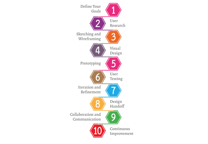
1. Define Your Goals
First things first, you need to clearly define your goals and objectives for the app.
What problem does it solve?
Who is your target audience?
Understanding these aspects will help you shape the design accordingly.
2. User Research
To create a user-friendly android app design, you need to understand your audience. Conduct user research to gather insights into their needs, preferences, and behaviors.
This research will guide your design decisions and ensure that your app resonates with users.
3. Sketching and Wireframing
Now it’s time to put your ideas on paper! Start by sketching rough concepts of your app’s screens and interactions.
Once you have a basic structure, create wireframes, which are simplified visual representations of the app’s layout. This step helps you visualize the app’s structure and flow.
4. Visual Design
With the wireframes in hand, it’s time to bring your app to life visually.
Choose a color scheme that aligns with your brand or target audience. Create high-fidelity mockups that showcase the app’s interface, typography, colors, and icons.
This stage is all about creating an appealing and engaging visual experience.
5. Prototyping
Now, it’s time to prototype your app.
Prototypes are interactive mockups that simulate the app’s functionality. Use prototyping tools to create clickable prototypes, allowing you to test and refine the user experience before diving into development.
6. User Testing
Don’t forget to involve your target users in the process! Conduct user testing sessions where real users interact with your prototype.
Observe their behavior, gather feedback, and identify any usability issues. This valuable input will help you refine and improve your app’s design.
7. Iteration and Refinement
Based on user feedback, iterate on your android app design.
Make necessary adjustments, refine the UI elements, and address any usability concerns.
The goal is to create a polished and intuitive design that meets user expectations.
8. Design Handoff
Once you’re satisfied with the android app design, it’s time to hand it off to the mobile app development team.
Provide them with the necessary design assets, style guides, and specifications. Collaborate closely with the developers to ensure a smooth transition from design to development.
9. Collaboration and Communication
Throughout the design process, maintain open communication and collaboration with your team.
Designers, developers, and stakeholders should be on the same page to ensure a cohesive and successful app design.
10. Continuous Improvement
Remember, android app design is not a one-time thing.
Keep an eye on user feedback and analytics after your app is launched. Gather insights, identify areas for improvement, and implement updates to enhance the user experience.
Common Mistakes To Avoid in Android App Design

More often than not, app designers and developers tends to make mistakes in android app designing process.
Now, learning from the mistakes that others have already made, there are some things that you should avoid doing. And we shall be going through them below:
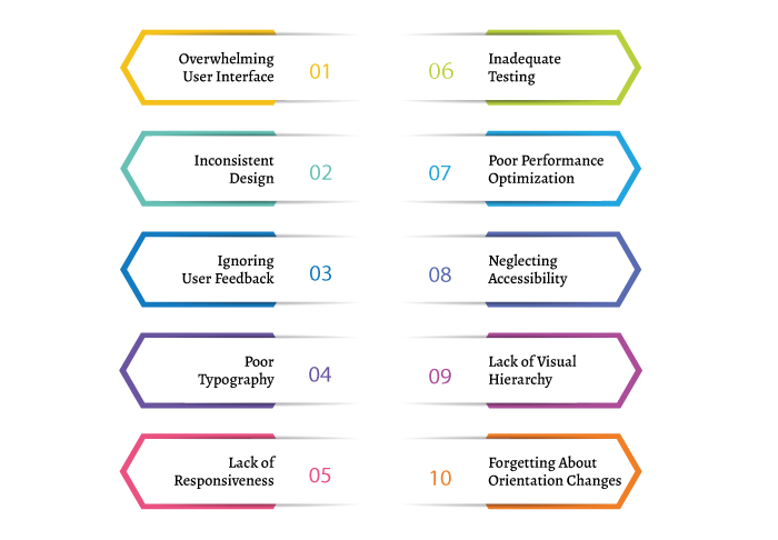
· Overwhelming User Interface
Don’t overwhelm your users with a cluttered and complex interface. Keep things clean, simple, and intuitive. Avoid cramming too many features or information into a single screen. Instead, prioritize essential elements and guide users through a clear and logical flow.
· Inconsistent Design
Consistency is key! Ensure a consistent design throughout your app by following the principles of Material Design. Use standardized icons, fonts, and colors to create a cohesive experience. Inconsistent design elements can confuse users and make your app feel unprofessional.
· Ignoring User Feedback
Your users are your best source of feedback. Don’t make the mistake of ignoring their opinions and suggestions. Actively listen to user feedback, conduct usability testing, and iterate on your design based on their input. By involving users in the process, you can create an app that truly meets their needs.
· Poor Typography
Typography plays a significant role in readability and overall user experience. Avoid using tiny fonts that strain the eyes or illegible typefaces. Opt for clear and legible fonts with appropriate sizes and line spacing. Ensure that your text contrasts well with the background to enhance readability.
· Lack of Responsiveness
Android devices come in various sizes and resolutions, so it’s essential to design your app to be responsive. Don’t overlook the importance of creating layouts that adapt to different screen sizes. Test your app on various devices to ensure a consistent and visually appealing experience for all users.
· Inadequate Testing
Testing is crucial for identifying and fixing design flaws. Don’t rush through this stage or rely solely on automated testing. Engage in manual testing and gather feedback from real users to uncover usability issues, bugs, or performance glitches. This allows you to refine your design and provide a smoother experience.
· Poor Performance Optimization
App performance is a critical aspect of user satisfaction.
Slow loading times, laggy animations, and frequent crashes can frustrate users.
Optimize your app’s performance by minimizing unnecessary animations, optimizing image sizes, and testing on different devices to ensure smooth operation.
· Neglecting Accessibility
Don’t forget about accessibility!
Ensure your app is accessible to users with disabilities. Provide options for adjusting text size, color contrast, and support assistive technologies like screen readers.
By considering accessibility from the start, you create an inclusive experience for a wider range of users.
· Lack of Visual Hierarchy
Visual hierarchy guides users through the app’s content and actions.
Avoid the mistake of not establishing clear visual cues. Use size, color, spacing, and typography to highlight important elements and create a hierarchy that directs users’ attention.
This helps users understand the app’s structure and navigate efficiently.
· Forgetting About Orientation Changes
Android devices can be used in both portrait and landscape orientations.
Neglecting landscape mode can lead to a poor user experience. Ensure your android app design adapts seamlessly to different orientations, providing a consistent and enjoyable experience regardless of how the user holds their device.
Android App Design Trends
If you want your app to stand out from the crowd, it’s essential to keep up with the latest android app design trends.
So, let’s explore some of the hottest Android app design trends that you should consider incorporating into your next project.
Get ready to add a fresh touch to your app!
Neumorphism
Neumorphism is a design style that combines skeuomorphism and flat design. It creates a soft, three-dimensional look by using subtle shadows and highlights. This trend adds depth and realism to your app’s elements, making them visually engaging and inviting to touch.
Dark Mode
Dark mode has taken the app world by storm. It offers a sleek and modern look while reducing eye strain and conserving battery life. Embrace the dark side by incorporating a dark color scheme into your app, and give users the option to switch between light and dark modes.
Bold and Vibrant Colors
Don’t shy away from vibrant colors! Bold and saturated color palettes are trending in Android app design. They add energy and excitement to your app’s interface. Consider using gradients and contrasting color combinations to create eye-catching visuals that leave a lasting impression.
Custom Illustrations and Animations
Stand out with unique custom illustrations and animations. These personalized visuals add a touch of personality and charm to your app. Whether it’s playful characters or delightful motion effects, custom graphics can enhance the overall user experience and make your app memorable.
Microinteractions
Microinteractions are small, subtle animations or feedback that respond to user actions. They provide delightful moments of interaction and make your app feel alive. Consider incorporating microinteractions in the form of button animations, loading spinners, or animated feedback to create a more engaging and interactive experience.
Minimalist Interfaces
Less is more! Minimalism continues to be a popular design approach. Clean and simple interfaces with ample white space can create a sense of elegance and sophistication. Focus on essential elements and remove clutter to provide users with a seamless and distraction-free experience.
Floating Action Buttons (FABs)
Floating action buttons are a staple in Android app design. They provide a quick and easily accessible way to perform the primary action in your app. Consider using FABs for key actions, such as adding an item or composing a message, to enhance usability and streamline user interactions.
Voice User Interface (VUI)
With the rise of voice assistants, integrating voice interactions into your app can be a game-changer. Incorporate voice commands and responses to enable hands-free and intuitive interactions. This trend adds convenience and accessibility to your app, making it more user-friendly.
Geometric Shapes and Patterns
Geometric shapes and patterns are making a comeback in app design. From circular buttons to hexagonal icons, geometric elements can add visual interest and a modern touch to your app’s interface. Experiment with different shapes and patterns to create a unique and visually appealing design.
Gestures and Navigation
As gesture-based navigation becomes more prevalent, consider adopting intuitive gestures in your app. Replace traditional navigation bars with swipe gestures or edge swipes for seamless navigation. This trend offers a more immersive and intuitive user experience.
Conclusion
And with this, we have come to the end of our blog about android app design. Now, if you are someone who wants to design an masterful app that attract customers and leave your audience in awe, contact a UI/UX Design company.
FAQ
Android app design is crucial for creating a user-friendly experience, ensuring easy navigation, visual appeal, and seamless interactions.
Material Design is a design language developed by Google for Android apps. It emphasizes tactile materials, bold colors, responsive animations, and consistent UI elements.
Avoid overwhelming UI, inconsistent design, poor typography, lack of responsiveness, neglecting user feedback, and inadequate testing.
Neumorphism, dark mode, bold colors, custom illustrations, microinteractions, minimalist interfaces, floating action buttons, voice user interface, geometric shapes, and gesture-based navigation.
Incorporate unique visuals, follow current design trends, focus on usability, create a cohesive experience, and embrace customization options.
The design process includes defining goals, user research, sketching and wireframing, visual design, prototyping, user testing, iteration and refinement, design handoff, collaboration, and continuous improvement.
Consider accessibility features like adjustable text size, color contrast, and support for assistive technologies to make your app inclusive for users with disabilities.
Consistency creates familiarity, enhances usability, and provides a seamless user experience across different screens and devices.
Optimize animations, images, and layouts for smooth performance. Test your app on various devices to ensure efficient operation.
User feedback helps identify usability issues, improve the design, and create an app that meets the needs and expectations of your target audience.


No Comments
Comments are closed.