Table of Contents
Color psychology in app design is becoming a trend.
But why?
For starters, 85% of consumers cite color as the primary reason for choosing a particular app. The colors you choose for your app design have a profound effect on how users feel, interact, and engage with your application.
By empathizing with your users and delving into the meanings and emotions associated with each hue, you will gain the insights needed to craft a visually compelling and emotionally resonant app.
So, are you ready to embark on an eye-opening adventure into the world of color psychology in app design?
Let’s dive in and discover the art of harnessing colors to create captivating and emotionally impactful user experiences.
Understanding Color Psychology
When exploring color psychology in app design, you are putting yourself in the shoes of another individual and trying to comprehend their feelings, emotions, and reactions to different colors.
It involves empathizing with someone else’s perspective and understanding how colors may affect their mood, behavior, and perceptions.
Imagine yourself as this person, and as you encounter different colors, try to feel how each hue influences your emotions and thoughts.
Well, different colors do
Colors and Their Effect on Human Psychology
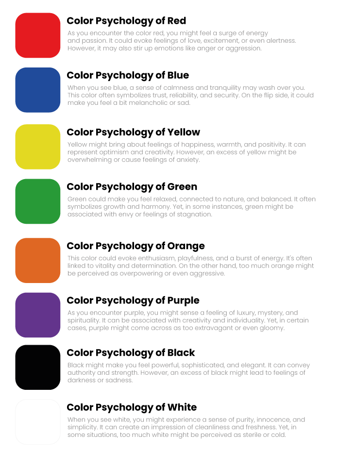
Color Psychology of Red:
As you encounter the color red, you might feel a surge of energy and passion. It could evoke feelings of love, excitement, or even alertness. However, it may also stir up emotions like anger or aggression.
Color Psychology of Blue:
When you see blue, a sense of calmness and tranquility may wash over you. This color often symbolizes trust, reliability, and security. On the flip side, it could make you feel a bit melancholic or sad.
Color Psychology of Yellow:
Yellow might bring about feelings of happiness, warmth, and positivity. It can represent optimism and creativity. However, an excess of yellow might be overwhelming or cause feelings of anxiety.
Color Psychology of Green:
Green could make you feel relaxed, connected to nature, and balanced. It often symbolizes growth and harmony. Yet, in some instances, green might be associated with envy or feelings of stagnation.
Color Psychology of Orange:
This color could evoke enthusiasm, playfulness, and a burst of energy. It’s often linked to vitality and determination. On the other hand, too much orange might be perceived as overpowering or even aggressive.
Color Psychology of Purple:
As you encounter purple, you might sense a feeling of luxury, mystery, and spirituality. It can be associated with creativity and individuality. Yet, in certain cases, purple might come across as too extravagant or even gloomy.
Color Psychology of Black:
Black might make you feel powerful, sophisticated, and elegant. It can convey authority and strength. However, an excess of black might lead to feelings of darkness or sadness.
Color Psychology of White:
When you see white, you might experience a sense of purity, innocence, and simplicity. It can create an impression of cleanliness and freshness. Yet, in some situations, too much white might be perceived as sterile or cold.
Importance of Color Psychology in App Design
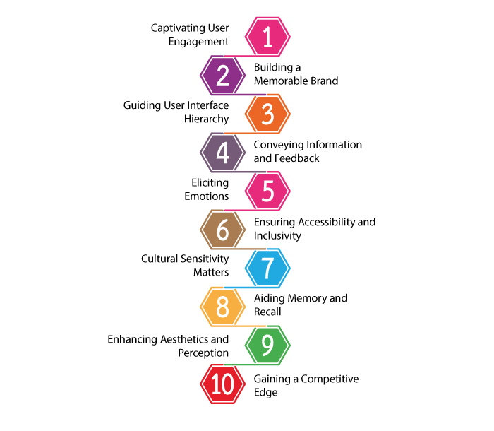
Color psychology plays a crucial role in app design as it can significantly impact users’ emotions, behaviors, and overall experience.
Here are some key reasons why color psychology is important in app design:
Captivating User Engagement
When you choose colors for your app, think about how they can captivate and hold the attention of your users.
Vibrant and harmonious color combinations can make your app visually appealing, enticing users to explore its features further.
Building a Memorable Brand
As you select the color palette for your app, consider how these colors align with your brand identity.
Consistent use of colors across your app establishes brand recognition and fosters a connection between your app and your brand.
This is one of the reason to use color psychology in app design.
Guiding User Interface Hierarchy
Use the power of colors to create a clear hierarchy in your app’s user interface.
Highlight essential elements like call-to-action buttons, notifications, or important information using contrasting colors to guide users toward key actions.
Conveying Information and Feedback
Leverage colors to communicate information effectively.
For example, using red to indicate errors or warnings and green for successful actions helps users grasp the app’s response quickly.
Eliciting Emotions
Delve into the emotional impact of colors. Warm colors like red or orange can evoke excitement or urgency, while cool colors like blue and green promote a sense of calmness and trust.
Understand these emotional associations to design an app that resonates with users’ feelings. And this is how you can use color psychology in app design.
Ensuring Accessibility and Inclusivity
Show empathy to all users by considering accessibility in your color choices.
Opt for color contrasts that aid users with visual impairments, ensuring your app is inclusive and user-friendly for everyone.
Cultural Sensitivity Matters
Acknowledge the diverse cultural meanings and associations of colors.
Being aware of these variations helps you avoid misunderstandings or unintentionally alienating certain user groups.
Aiding Memory and Recall
Connect colors with specific features or functions in your app to enhance user memory and recall. Consistent color usage assists users in navigating the app with ease and familiarity.
Enhancing Aesthetics and Perception
Create an aesthetically pleasing app through carefully selected colors.
Remember that the visual aspect profoundly impacts users’ perception of your app’s quality and professionalism.
Gaining a Competitive Edge
In a fiercely competitive app market, thoughtful and unique color choices can set your app apart from the rest.
Stand out with an engaging and visually striking design that leaves a lasting impression on your users.
Now, with this out of the way, it’s time to discuss.
Real-Life Example of Color Psychology in App Design
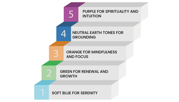
Imagine you’re using a popular meditation app called “ZenMind.” The app is available on App Store and Google Play Store as well.
Here’s how color psychology is incorporated into its design:
Soft Blue for Serenity
When you open the ZenMind app, you’re greeted with a serene and gentle blue background.
Blue is associated with tranquility and relaxation, instantly putting you in a calm state of mind. This color choice is intentional, as it sets the tone for your meditation session and helps you disconnect from the outside world.
Green for Renewal and Growth
As you complete a meditation session or achieve a milestone, the progress bar and achievement badges light up in a refreshing green hue.
Green symbolizes renewal, growth, and harmony with nature. Seeing this color reinforces the positive effects of meditation, motivating you to keep up with your practice.
Orange for Mindfulness and Focus
In the “Breathing Exercises” section, the play button and timer are highlighted in a warm orange color.
Orange is known to promote enthusiasm, mindfulness, and focus. By using this color for the essential elements of the app, ZenMind encourages you to be fully present during your breathing exercises.
Neutral Earth Tones for Grounding
The app’s nature-themed meditation sessions often feature neutral earth tones like browns and greens.
These colors evoke a sense of grounding, stability, and connection to the natural world. When meditating with these visuals, you feel more centered and at peace with yourself and your surroundings.
Purple for Spirituality and Intuition
In the “Mindful Moments” section, where you can set reminders for mindful breaks throughout the day, the timer and notification icons are in a soft shade of purple.
Purple is associated with spirituality and intuition. This choice of color helps you remember to pause and connect with your inner self, even during busy times.
Mobile App Branding And Color
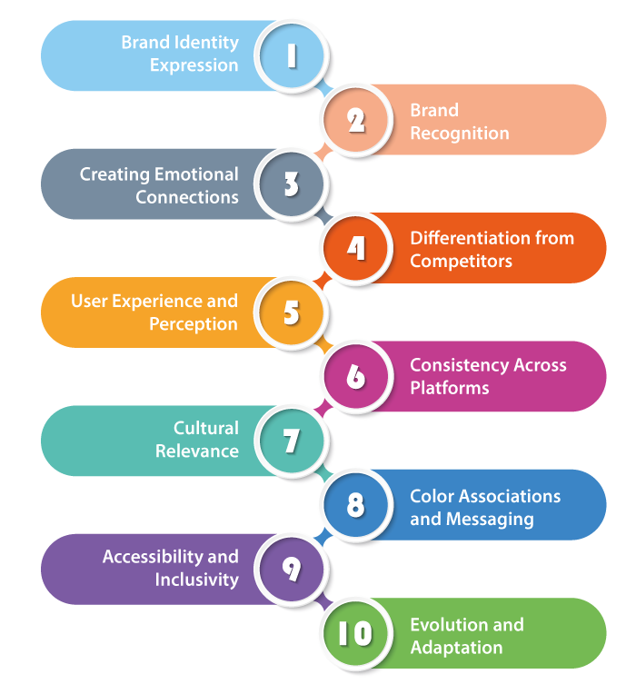
In the world of mobile app branding, your choice of colors plays a vital role in establishing a strong and memorable identity for your app.
As you delve into the relationship between mobile app branding and color, consider these important aspects:
Brand Identity Expression
The colors you select for your mobile app are a reflection of your brand’s identity and personality.
By choosing a color scheme that aligns with your brand values and message, you create a cohesive and consistent brand image.
Brand Recognition
Consistency in using colors throughout your app fosters brand recognition.
When users encounter your app’s distinctive color palette repeatedly, it helps them associate those colors with your brand, making it easier for them to remember and recall your app in the future.
Creating Emotional Connections
Colors have the power to evoke emotions and feelings.
When you use colors that resonate with your target audience’s emotions and preferences, you create a deeper emotional connection between users and your app.
Differentiation from Competitors
In a competitive app market, a unique and well-thought-out color scheme can set your app apart from similar offerings.
It helps users distinguish your app from competitors and reinforces its individuality.
User Experience and Perception
Colors influence how users perceive and interact with your app.
A well-designed color palette can enhance the user experience, making the app more inviting and user-friendly. Thus, ensuring the importance of color psychology in app design.
Consistency Across Platforms
If your app is part of a broader brand ecosystem, using consistent colors across different platforms (such as website, social media, and marketing materials) creates a seamless and unified brand experience for users.
Cultural Relevance
Consider cultural connotations and associations of colors in different regions.
Adapting your color choices to suit cultural preferences demonstrates respect and ensures your app’s branding remains relevant and relatable to diverse audiences.
Color Associations and Messaging
Certain colors are associated with specific messages or meanings.
For instance, blue often conveys trust and reliability, while red can signify excitement or urgency.
Utilize these color associations strategically to convey your app’s intended message effectively.
Accessibility and Inclusivity
Thoughtful color choices can enhance the accessibility of your app.
Ensure sufficient color contrast to accommodate users with visual impairments and create an inclusive experience for all users.
Evolution and Adaptation
As your app evolves or undergoes updates, be mindful of how color changes can impact your brand perception.
Gradual adjustments to the color palette can signal growth and evolution while maintaining brand recognition.
Impact of color on conversion rates
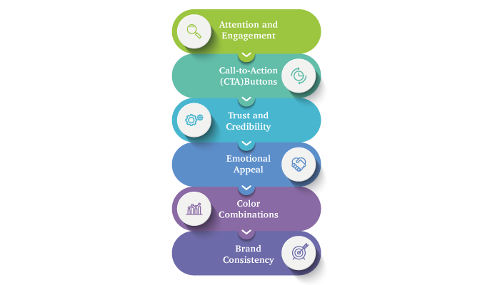
When it comes to conversion rates, the impact of color on your website or app design is significant and can greatly influence your users’ behavior and decision-making.
As you explore the relationship between color psychology in app design and conversion rates, keep these important points in mind:
Attention and Engagement
Colors can grab your attention and influence how long you stay on a webpage or app.
Vibrant and contrasting colors strategically placed can captivate users and encourage them to explore further, ultimately increasing the chances of conversion.
Call-to-Action (CTA) Buttons
The color of your CTA buttons can have a profound effect on conversion rates.
Selecting a color that stands out and contrasts with the rest of the design helps draw attention to the button, making it more likely for users to click on it.
Trust and Credibility
Certain colors are associated with trust and credibility. For example, blue often instills a sense of reliability.
By incorporating trustworthy colors into your design, users may feel more comfortable making a purchase or providing their information, positively impacting conversion rates.
Emotional Appeal
Colors evoke emotions, and leveraging this can influence user decisions.
Understanding your target audience and using colors that align with their emotions and preferences can create a stronger emotional connection, leading to higher conversion rates.
Color Combinations
The right combination of colors can enhance the overall user experience and encourage users to take action.
Harmonious color schemes create a pleasant visual experience that encourages users to engage further with your content and, consequently, improve conversion rates.
Brand Consistency
Aligning your color choices with your brand identity fosters brand recognition and trust.
Consistency in colors across different platforms helps users recognize and associate your brand, which can positively impact conversion rates.
How To Apply Color Psychology in App Design?
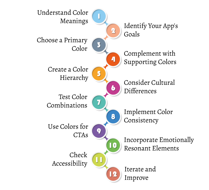
It’s time to answer this big question, how do you apply color psychology in app design? Well, the answer is simple, you have to hire an app designer and follow the process below:
1. Understand Color Meanings
Familiarize yourself with the meanings and emotions associated with different colors. Learn how each hue can influence user perceptions, emotions, and behaviors.
2. Identify Your App’s Goals
Determine the primary goals of your app and the emotions you want to evoke in users. Align your color choices with these objectives to create a cohesive and meaningful user experience.
3. Choose a Primary Color
Select a primary color that represents the essence of your app and aligns with its purpose. Consider the emotions associated with the color and how it resonates with your target audience.
4. Complement with Supporting Colors
Choose a few supporting colors that harmonize with the primary color. These colors should enhance the user experience, provide visual contrast, and guide users to important elements.
5. Create a Color Hierarchy
Use color to establish a visual hierarchy in your app’s user interface. Highlight important elements like buttons or notifications with contrasting colors to attract user attention.
6. Consider Cultural Differences
Be mindful of the cultural connotations of colors in different regions. Adapt your color choices to suit the preferences and sensitivities of diverse audiences.
7. Test Color Combinations
Experiment with various color combinations to see how they interact with each other and the overall app design. Use user testing and feedback to identify the most effective combinations.
8. Implement Color Consistency
Maintain consistency in using colors throughout your app. Consistent color usage builds brand recognition and ensures a coherent user experience.
9. Use Colors for CTAs
Utilize color psychology when designing call-to-action (CTA) buttons. Use attention-grabbing colors that encourage users to take the desired actions, such as making a purchase or signing up.
10. Incorporate Emotionally Resonant Elements
Infuse emotionally resonant elements with colors, such as using calming blues for relaxation apps or energizing oranges for fitness-related apps.
11. Check Accessibility
Ensure your color choices meet accessibility standards by providing sufficient contrast for users with visual impairments. Legible text against the background colors is crucial for usability.
12. Iterate and Improve
Continuously monitor user interactions and conversions to see how your color choices impact the user experience. Be willing to iterate and improve your color scheme based on data and user feedback.
Conclusion
Color psychology in app design is a powerful tool that can significantly influence user emotions, behaviors, and overall experiences.
By understanding the meanings and associations of different colors, app developers can strategically use colors to captivate users, build brand recognition, and create emotionally resonant designs.
Thoughtful color choices can enhance user engagement, guide user interactions, and positively impact conversion rates.
If you want to apply this principle to your app, we recommended that you work with a top app designing company.
FAQ
Color psychology in app design refers to the use of colors to evoke specific emotions, influence user behavior, and enhance the overall user experience.
Different colors evoke varying emotions. Warm colors like red can create excitement, while cool colors like blue promote calmness and trust.
Understand your app’s goals and target audience. Select a primary color that aligns with your app’s purpose and complements it with supporting colors for visual contrast.
Colorful and contrasting CTA buttons attract user attention, prompting them to take desired actions like signing up or making a purchase.
Yes, cultural associations with colors vary globally. Be mindful of cultural preferences to ensure your app design is inclusive and relatable.
Use A/B testing to experiment with different color combinations and analyze user responses to identify the most effective choices.
Ensure your color choices meet accessibility standards, providing sufficient contrast for users with visual impairments.
Absolutely. Thoughtful use of colors enhances user engagement, emotional connections, and overall app experience.
Yes, consistent colors build brand recognition and create a cohesive user experience.
Yes, user feedback helps refine your color choices, ensuring your app design aligns better with user preferences and goals.


No Comments
Comments are closed.