Table of Contents
iOS app development is trending, if you want to master it, you need to understand iOS app design guidelines.
App development is one of the most important aspect of developing a mobile app “technically”. However, when it comes to attracting users and converting them into customers, what you need is remarkable iOS app design.
Now, if you want to create great iOS app design encompassing User interface and user experience, there are some guidelines. If you are someone who wants to create the next best iOS app, this blog is for you.
Here, we shall be getting into entire concept of IOS app design including HIG, principles, and other related things. Therefore, with this being said, let’s get right into it:
What is HIG? Human Interface Guidelines
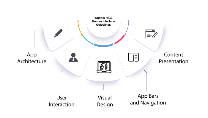
One of the first thing you need to know about iOS app design is, HIG.
The term HIG stands from human interface guidelines. These are guidelines to create humane design for iOS apples
The Foundation of iOS App Design Apple’s Human Interface Guidelines (HIG) serve as the cornerstone for designing iOS apps.
They provide a set of principles and best practices that promote consistency, usability, and a delightful user experience.
Moreover, Understanding and following the HIG is crucial for creating apps that feel native to iOS. Let’s delve into the key components of the HIG
App Architecture
The first and by far the most important thing is to understand the concept of app objects, which represent the fundamental building blocks of your app’s functionality.
Here, you need to cover aspects like app states, including the active, inactive, background, and suspended states, and how to manage them effectively.
Moreover, it’s also important to understand idea of app life cycle management to ensure smooth transitions between states and efficient resource usage.
User Interaction
Whether you talk about iOS app development or designing, user remains center of attention. That’s when you are understanding about HIG, you need to understand fundamental principles of user interaction, such as direct manipulation, feedback, and user control.
This will take you across various topics including touch input guidelines, including the appropriate size, spacing, and targets for touch controls.
Now, if you are new to the entire iOS app designing concept, you should also explore gesture-based interfaces, incorporating standard gestures like tap, swipe, pinch, and custom gestures when necessary.
Furthermore, getting to know, proper use of controls, such as buttons, sliders, switches, and pickers, to provide familiar and intuitive interactions will give you an edge.
Visual Design
Let’s discuss one of the most important part of entire HIG concept, the visual design.
Now, the first thing that comes to mind when you read this point is, UI/UX design, and rightfully so.
Well, what you need to do to create a perfect iOS app UI/UX Design is, understand Appl’e design language,.
As such, one of the most important thing here is, the effective use of typography, color, and layout.
In addition to this, you should also get to know about the principles of visual hierarchy and how to guide users’ attention through the use of size, contrast, and spacing.
You can also learn about adaptive layouts and how to design interfaces that adapt to different device sizes and orientations, leveraging features like Auto Layout and Size Classes.
-
Color Palette
Choose a cohesive color palette that aligns with your app’s branding and provides visual consistency.
-
Accessibility
Ensure that your app meets accessibility standards, considering color contrast for users with visual impairments.
-
Visual Feedback
Incorporate visual cues, such as animations or transitions, to provide feedback and enhance user interactions.
App Bars and Navigation
If you have ever used an iOS device, you know how important app bars and navigation is.
Well, if you want to create that for your app, you need to understand the principles of effective navigation, including the proper use of navigation bars, tab bars, and toolbars.
If you want to get advanced level, you should also explore techniques for hierarchical navigation, modal views, and contextual menus to provide seamless navigation experiences.
Content Presentation
Last but not least, content presentation.
Well, you see, whether it is corporate branding or designing an iOS app, content is the king.
Therefore, if you want to present your content in a way that attract customers and keep them engaged, you need to understand guidelines for presenting content. This include things such as tables, collections, and grids, while ensuring a balanced visual and information hierarchy
Moreover, the use of view controllers to present and manage data is yet another important concept you need to understand.
So, this is all you need to know about the concept of iOS app designing base, the human interface.
Moving on, we shall be going though iOS app design principles. And with this being said, let’s get right into it.
Understanding iOS App Design Principles
To create successful iOS apps, it is essential to grasp the fundamental design principles that Apple emphasizes.
Now, there are a number of principles that play important role in UI/UX designing. To give you an idea of how it works, we shall be discussing all of that in this section of the blog.
Therefore, let’s get right into it.
Clarity
Prioritize clarity and legibility in your app’s design, ensuring that users can easily understand and interact with the interface.
Deference
Maintain a sense of depth and hierarchy, utilizing subtle visual cues and animations to guide users through your app.
Consistency
Follow Apple’s Human Interface Guidelines (HIG) to maintain a consistent experience across iOS devices, making it easier for users to navigate and interact with your app.
Depth
Utilize depth and layered visuals to create a sense of realism and enhance the user experience.
iOS App Design Examples
well, if you want to create a killer iOS app design, you need to learn from the best. And in this section, we shall be going through some of the best design iOS Apps on the market.
Learning from these examples you can make a lot of improvement in your own app design or app redesign if you are doing it all over again.
In any case, these are, as mentioned below:
Apple Music
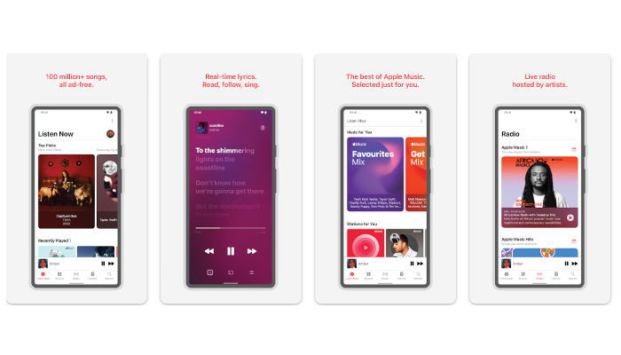
Apple Music app follows the iOS design principles while incorporating its own unique visual elements. The app features a clean and intuitive interface with a focus on album art, easy navigation through tabs, and a clear hierarchy of content. It provides a seamless music streaming experience with a consistent design language that aligns with Apple’s guidelines.
Airbnb
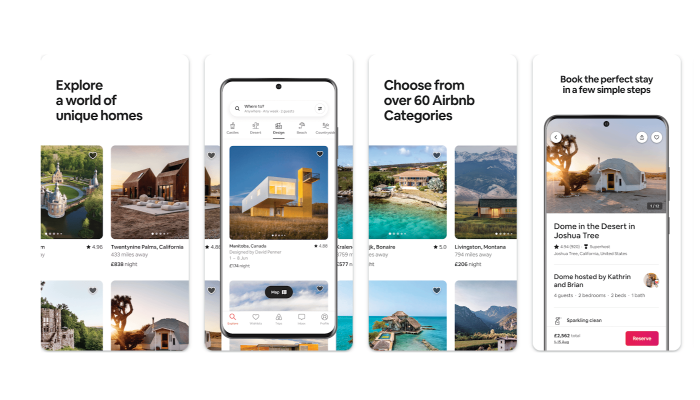
The Airbnb app provides a great example of how to incorporate visual imagery while maintaining simplicity. It utilizes large, high-quality images to showcase listings, and the interface is designed to guide users through the booking process effortlessly. The app’s use of color, typography, and intuitive gestures ensures a delightful user experience.
Headspace
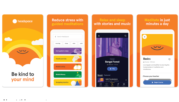
Headspace is a meditation and mindfulness app that exemplifies the importance of creating a calming and intuitive interface. The app uses a soothing color palette, subtle animations, and clear typography to provide a serene and focused experience. The design emphasizes simplicity and clarity, enabling users to navigate through different meditation sessions with ease.
Evernote
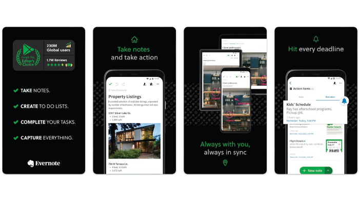
Evernote is a note-taking app that demonstrates the power of organization and consistent design. The app features a clean and structured interface, allowing users to create and manage notes effortlessly. It incorporates a consistent visual language, including a recognizable color scheme, iconography, and typography, making it easy for users to identify and interact with different elements.
Shazam
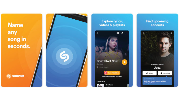
Shazam showcases the importance of providing a seamless and engaging experience for users. The app’s interface is designed to make music recognition effortless, with a prominent “Shazam” button and real-time audio visualization. The app’s design focuses on clarity and responsiveness, providing users with immediate feedback and a smooth transition from audio recognition to displaying song details.
With this being said, let’s move to the next section, where we shall be going through app store review guidelines in the next section.
App Store Review Guidelines

We went through all you need to know about iOS app design. Now, once you have created the app, it’s time to launch the platform.
To get your iOS app published on the App Store, it must comply with Apple’s App Store Review Guidelines. These guidelines focus on maintaining quality, security, and a positive user experience.
Familiarize yourself with these guidelines to avoid rejections and ensure your app meets Apple’s requirements.
Functionality and Design
The first thing you need to learn here are the restrictions on prohibited content, unauthorized use of private APIs, and compatibility with the latest iOS versions.
Here, understanding the guidelines for user privacy, data handling, and advertising within your app, ensuring compliance with legal and ethical standards.
Performance and Stability
It goes without saying when reviewing an app, performance is one of the main factor. Well, speaking of which, that’s also one of the main criterion app store uses.
Therefore, you should go through the requirements for app performance, responsiveness, and optimization, ensuring a smooth and seamless user experience.
Now, what makes you ensure the app is up to mark is things like thorough testing, minimizing crashes, and optimizing resource usage to provide a stable app.
User Experience
Lastly, user experience.
You need to understand the importance of providing value to users, avoiding excessive interruptions, and encouraging engagement.
Furthermore, if you can learn about guidelines related to intuitive user interfaces, clear navigation paths, and appropriate use of notifications, that would you along the run.
Conclusion
Designing an iOS app that adheres to Apple’s design guidelines is crucial for creating a visually appealing, intuitive, and user-friendly application.
By understanding and implementing the principles, guidelines, and best practices discussed in this comprehensive guide, you can enhance the overall user experience and increase the chances of your app’s success in the competitive iOS app development landscape.
Remember, thoughtful design decisions can significantly impact user engagement and ultimately contribute to the success of your iOS app.
FAQ
The Human Interface Guidelines (HIG) are Apple’s set of principles and best practices for designing intuitive and user-friendly iOS apps.
Following the HIG ensures that your app feels native to iOS, providing a consistent and familiar user experience across the platform.
Designing for accessibility involves incorporating features like VoiceOver, Dynamic Type, and proper labeling of UI elements to make your app usable by people with disabilities.
When designing, ensure sufficient contrast between text and background colors, and use shapes, patterns, and textures to convey information instead of relying solely on color.
Support accessibility APIs, incorporate custom actions and traits, and manage focus properly to ensure compatibility with assistive technologies like Siri and Voice Control.
The App Store Review Guidelines cover factors such as app functionality, design, performance, stability, user experience, privacy, and adherence to legal and ethical standards.
Optimizing app performance, minimizing crashes, and ensuring stability are essential for providing a seamless and reliable user experience.
Focus on clear navigation paths, appropriate use of notifications, and a visually appealing design to create an intuitive user interface.
Follow guidelines for user privacy, data handling, and ensure that your app respects user preferences regarding data collection and usage.
By adhering to design guidelines, providing a delightful user experience, and creating an app that adds value to users’ lives, you can make your app stand out in the competitive App Store market.


No Comments
Comments are closed.