Table of Contents
With every growing mobile app market and it’s fluid nature, a platform has to change if it wants to maintain it’s dominance. And this is where the concept of mobile app redesign comes in.
You see, as the time progresses so does the design philosophies, user’s need, and the UX of different platforms. To maintain market dominance a mobile app regardless of their niche or performance has to change it’s design.
This is something that we have seen in a lot of the larger platform including likes of amazon, spotify, AirBnB and so on.
If you are someone who wants to redesign app of your business and want to learn more about the concept, this blog is for you.
In this mobile app redesign guide, we shall be discussing everything starting from definition, types, to reasons and considerations. With this being said, let’ get right into it, starting with the basics:
What is App Redesign?
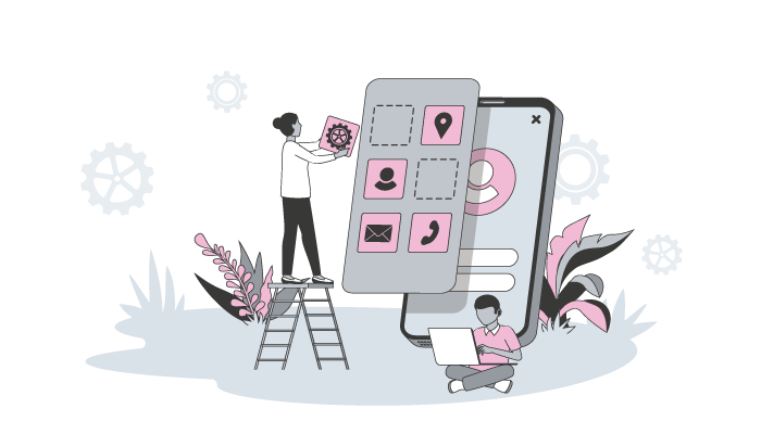
One of the first questions that a lot of people ask is, what exactly is app redesign? Well, the answer to this is very simple.
As the name suggests, the term “app redesign” refers to process of changing the look and feel of a mobile app with goal of ensuring an improved user experience.
Done right, mobile app redesign can lead to great things including more opportunity like improved downloads, lead generation, leading to improved revenue.
In fact, some of the major platforms have confide app redesign projects, including likes of Instagram, Google home app, amazon app, and so on.
Therefore, if you are someone who is wondering whether or not to consider it, here are some things to look for. But before that, let’s look at the different types of mobile app redesign in the section below.
Revolutionary vs Evolutionary App Redesign
So, when approaching the app redesign process, there are two ways that you can go, i.e. revolutionary app redesign and evolutionary app redesign.
| revolutionary App Redesign | evolutionary App Redesign | ||
| Definition | Completely reimagining and overhauling the app, thus introducing new features and changing core concept. | Incremental improvements and enhancements to the existing app, refining UX and addressing User Feedback | |
| Scope | Wide-ranging changes across the entire app. | Focused improvements on specific areas or features. | |
| User Experience | May require users to learn and adapt to the new design. | Familiarity is maintained, with gradual improvements. | |
| Disruption | Significant disruption for existing users. | Minimal disruption for existing users. | |
| Development Timeline | Longer development time due to extensive changes. | Shorter development time due to incremental changes. | |
| User Feedback | May require a fresh round of feedback from users. | Incorporates feedback from previous versions of the app. | |
| Risk | Higher risk of alienating existing user base. | Lower risk of alienating existing user base. | |
| Competitive Advantage | Offers the potential for a competitive edge and novelty. | Provides continuous improvement and refinement. | |
These are the two different type of app redesign and with this out of the way, let’s look at the reason to consider mobile app redesign in the section below.
Why Consider Mobile App Redesign
Now that you know what app redesign is and it’s different types, it’s time to ask, whether you should consider redesigning the mobile app or not?
Well, mobile app UI/UX Designing is difficult enough the first time, and doing it again can be double the work. So, before you go in with the App redesign projects, it’s important to consider reasons.
And here are some cases when you should consider redesigning your mobile application:
- If your app have a complex interface
- The conversion rate of the platform is low
- Upgrading backend technology
- Changing tech stack
- Higher number of negative customer review
- Legacy Design
- Niche not being relevant to target audience
These are the reason to consider mobile app redesign or what we call UX revamp. And with this out of the way, let’s look at some UI/UX Redesign case study to get inspired from.
UI/UX Redesign Case Study
There has been many instances when some of the world’s largest platform have gone through a compliment mobile app redesign process. And more often than not, it has worked in their favour.
So, if you are someone who is considering this, we highly recommended that you go through the follow redesign apps case study to learn how you can improve yours.
Amazon App Redesign:
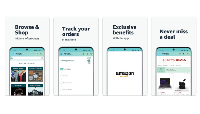
The Amazon app got a sleek makeover to enhance user experience. Here are the highlights:
- Clean Interface : Say goodbye to clutter! The app now has a cleaner and more intuitive interface, making navigation a breeze.
- Smarter Search: Searching is a breeze with improved filters. Now you can easily find the perfect product by price, brand, ratings, and more.
- Personalized Recommendations: Discover new products tailored to your preferences. The app suggests personalized recommendations based on your browsing and purchase history.
- Better Product Pages: Get all the info you need. The product pages now have high-quality images, detailed descriptions, customer reviews, and related products.
- Seamless Checkout: Checkout made easy. The process is now simpler and faster, with one-click ordering and smooth payment options.
Airbnb App Redesign:
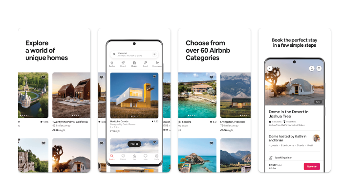
The Airbnb app got a makeover to make it even more immersive. Check out the key changes:
- Stunning Visuals: Feast your eyes on a modern and visually appealing design. The app now showcases high-quality images and larger fonts for a captivating experience.
- Improved Search: Finding the perfect accommodation is a breeze. The search and filter options have been enhanced, allowing you to easily refine results by location, price, amenities, and more.
- Effortless Booking: Booking made simple. The process is now intuitive and straightforward, allowing you to view available dates and prices easily.
- Connect with Others: Get social! The app now lets you connect with friends, share travel plans, and collaborate on group bookings, fostering a sense of community.
- Local Experiences: Discover the best of your destination. The app provides personalized travel guides and local recommendations to help you explore and find unique experiences.
Google Home App Redesign:
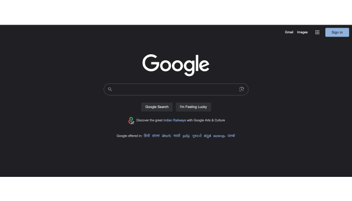
The Google Home app got a user-centric makeover. Here’s what’s new:
- Easy Device Management: Take control of your smart home effortlessly. The app now offers a simplified interface to manage your connected devices, view their status, and customize settings.
- Centralized Content: Your favorite media services, all in one place. The app integrates music streaming and video content providers into a unified interface for easy access and control.
- Seamless Voice Control: Interacting with your devices is a breeze. The app’s voice control features have been improved for a more intuitive and convenient experience.
- Personalized Routines: Automate with ease. Create and customize routines to control multiple devices, adjust settings, and get relevant information, all with a single command.
- Expanded Compatibility: The redesigned app now supports a wider range of smart home devices, allowing you to connect and control an even broader ecosystem of devices.
Instagram App Redesign:
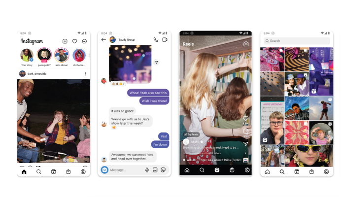
Instagram got a fresh new look for a more immersive experience. Here’s what’s changed:
- Tailored Home Feed: See what matters most. The home feed now prioritizes content from close friends and family, ensuring you see the posts you’re most likely to engage with.
- Stories at the Spotlight: Stories take center stage. They now have a dedicated placement at the top of the feed for easy viewing and interaction.
- Discover More: Find what interests you. The Explore page has been revamped to show personalized recommendations, trending content, and related topics to help you discover new accounts and content.
- Enhanced Messaging: Connect like never before. The messaging features have been improved with disappearing messages, reaction stickers, and enhanced group chat capabilities.
- Take Control: Manage your content your way. New tools allow you to filter comments, restrict accounts, and control who can tag or mention you in posts.
Spotify Redesign:
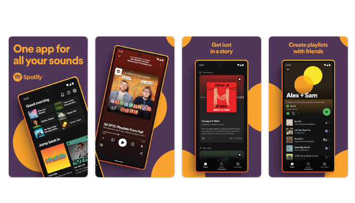
Spotify underwent a redesign to elevate your music experience. Here are the highlights:
- Personalized Home Screen: Discover your perfect soundtrack. The home screen now showcases tailored recommendations, curated playlists, and new releases to make finding music easier than ever.
- Simplified Navigation: Find your favorites with ease. The app’s navigation structure has been streamlined, making it effortless to access your library, playlists, and podcast subscriptions.
- Customized Playlists: Music made just for you. Enjoy personalized playlists like “Discover Weekly” and “Release Radar” that align with your tastes and preferences.
- Podcast Hub: Dive into the world of podcasts. Spotify now provides a dedicated section where you can browse and subscribe to your favorite shows, with personalized recommendations to enhance your listening experience.
- Social Vibes: Share the love for music. Connect with friends, share tracks, and create collaborative playlists to discover new music and foster a sense of community
App Redesign Process
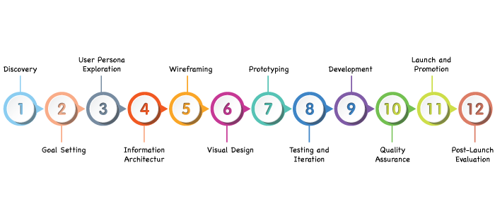
With all said and done, it’s time to learn about the mobile app redesign process in detail. The process can be long depending on the app and redesign itself.
However, there is a basic structure followed here. And in this section of the blog, we shall be discussing this entire process or structure of mobile app redesigning. Enough said, let get started with the first step i.e.
-
Discovery
The adventure begins with thorough research and analysis. Explore the existing app, its target audience, competitors, and market trends. Uncover pain points, gather user feedback, and identify areas for improvement. Think of it as an expedition to unearth valuable insights.
-
Goal Setting
Set clear objectives for the redesign. Define what you want to achieve, whether it’s enhancing user experience, increasing engagement, or aligning the app with current branding. Establishing goals will serve as your compass throughout the redesign expedition.
-
User Persona Exploration
Embark on a quest to understand your users better. Create detailed user personas, fictional characters that represent your target audience. Dive into their desires, motivations, and needs to build a strong connection with them.
-
Information Architecture
Map out the app’s structure like a skilled cartographer. Organize the content, features, and navigation in a logical and intuitive manner. Create a blueprint that guides users effortlessly through the app’s virtual landscape.
-
Wireframing
Equip yourself with wireframing tools and let your creativity soar. Sketch out low-fidelity designs that outline the app’s layout, placement of elements, and interactions. It’s like designing a treasure map, marking the spots where users will discover delightful features and functionalities.
-
Visual Design
This is where the colors, typography, and visual elements come to life. Craft a visually stunning and cohesive design that aligns with your brand identity. Embrace your inner artist and create a visual masterpiece that entices users to embark on a captivating mobile adventure.
-
Prototyping
Transform your static designs into interactive prototypes using prototyping tools. Allow users to experience the redesigned app before it’s fully developed. It’s like presenting a sneak peek of the treasure-filled kingdom, generating excitement and gathering valuable feedback.
-
Testing and Iteration
Set sail on a voyage of testing and iteration. Gather a crew of beta testers to explore the app, uncover hidden obstacles, and provide valuable feedback. Iterate on the designs based on user insights, fixing glitches and refining the experience until it shines like a polished gem.
-
Development
Assemble a team of skilled developers who will transform your designs into a functional app. Collaborate closely, ensuring the designs are translated seamlessly into code. It’s like constructing a ship that will sail smoothly through the vast app stores.
-
Quality Assurance
Prepare for the final leg of the journey by conducting thorough testing. Seek out any bugs, usability issues, or performance hiccups that might hinder the app’s success. Polish every corner until it sparkles like a treasure trove awaiting discovery.
-
Launch and Promotion
The moment has arrived to release your redesigned app into the wild. Unleash a wave of excitement through effective marketing and promotion. Engage with users, build anticipation, and celebrate the launch of your revamped app with a grand unveiling.
-
Post-Launch Evaluation
Your journey doesn’t end with the launch. Monitor the app’s performance, track user feedback, and analyze key metrics. Continuously improve and update your app, embracing an adventurous spirit that keeps it fresh and exciting.
Mistake To Avoid in App Redesigning
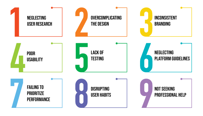
Now that you know what are the steps to mobile app redesigning, it’s time to discuss some mistakes to avoid when you redesign app.
-
Neglecting user research
Failing to understand user needs and preferences can result in a redesign that doesn’t address their pain points or improve the overall experience.
-
Overcomplicating the design
Strive for simplicity and avoid overwhelming users with too many features or a cluttered interface. Keep the design clean and intuitive.
-
Inconsistent branding
Ensure that the redesigned app aligns with the overall brand identity to maintain brand recognition and coherence.
-
Poor usability
An app redesign should focus on enhancing usability. Avoid introducing new design elements or interactions that may confuse or frustrate users.
-
Lack of testing
Failure to conduct thorough testing of the redesigned app can lead to unforeseen usability issues or technical glitches. Test across different devices and user scenarios.
-
Neglecting platform guidelines
Different platforms have specific design guidelines. Ignoring these guidelines may result in an app that feels out of place or confusing for users.
-
Failing to prioritize performance
A visually appealing design is important, but not at the expense of app performance. Ensure the redesigned app remains fast, responsive, and optimized.
-
Disrupting user habits
If users are accustomed to certain workflows or patterns in the existing app, consider maintaining those familiar elements to avoid alienating or frustrating users.
-
Not seeking professional help
Redesigning an app can be complex. Failing to involve experienced UI/UX designers or professionals may result in suboptimal outcomes. Therefore, it’s highly recommended that you consult an UI/UX Design Company.
FAQ
App design refers to the process of creating an interface and user experience for mobile applications. It is important as it influences user engagement and satisfaction, ultimately impacting the success of an app.
Create an intuitive user interface by focusing on simplicity, consistency, and clear navigation. Use familiar design patterns and prioritize user needs and goals.
Key elements of effective app design include visual hierarchy, typography, color schemes, iconography, and use of whitespace to enhance readability and usability.
Ensure a seamless user experience by optimizing app performance, reducing loading times, and providing smooth transitions between screens.
Stay updated with the latest app design trends such as minimalistic design, dark mode, and microinteractions, while following best practices for accessibility and responsive design.
Optimize app performance by minimizing unnecessary animations, optimizing image sizes, and using caching techniques. Reduce loading times by optimizing code and leveraging content delivery networks (CDNs).
Common app design mistakes to avoid include overcrowding screens, inconsistent design elements, complex navigation, and neglecting user feedback.
Conduct user testing by gathering feedback from target users, performing usability tests, and iterating based on the insights gained to improve app design.
Use design tools like Sketch, Figma, or Adobe XD for creating app prototypes and mockups. Leverage online resources, such as design blogs and UI kits, for inspiration and design assets.
Use design tools like Sketch, Figma, or Adobe XD for creating app prototypes and mockups. Leverage online resources, such as design blogs and UI kits, for inspiration and design assets.
Conclusion
If a mobile app regardless of it’s current status or performance in market, wants to retain it’s success, it needs to change with time and adaopt to trends of future. And this is where the entire concept of mobile app redesign comes in. If you are someone who was new to the concept, this blog did well to introduce you to the same. And with this, we have come to the end of our blog.


No Comments
Comments are closed.